Collapsible Fixed Element in Kadence
Disclosure: This post may contain affiliate links – meaning I get a commission if you decide to make a purchase through my links, at no cost to you.
Kadence recently introduced fixed-type of hooked elements allowing us to position Gutenberg-built block content in a fixed (always in view) position with various placement options like fixed on top, fixed on bottom, fixed top after scroll.
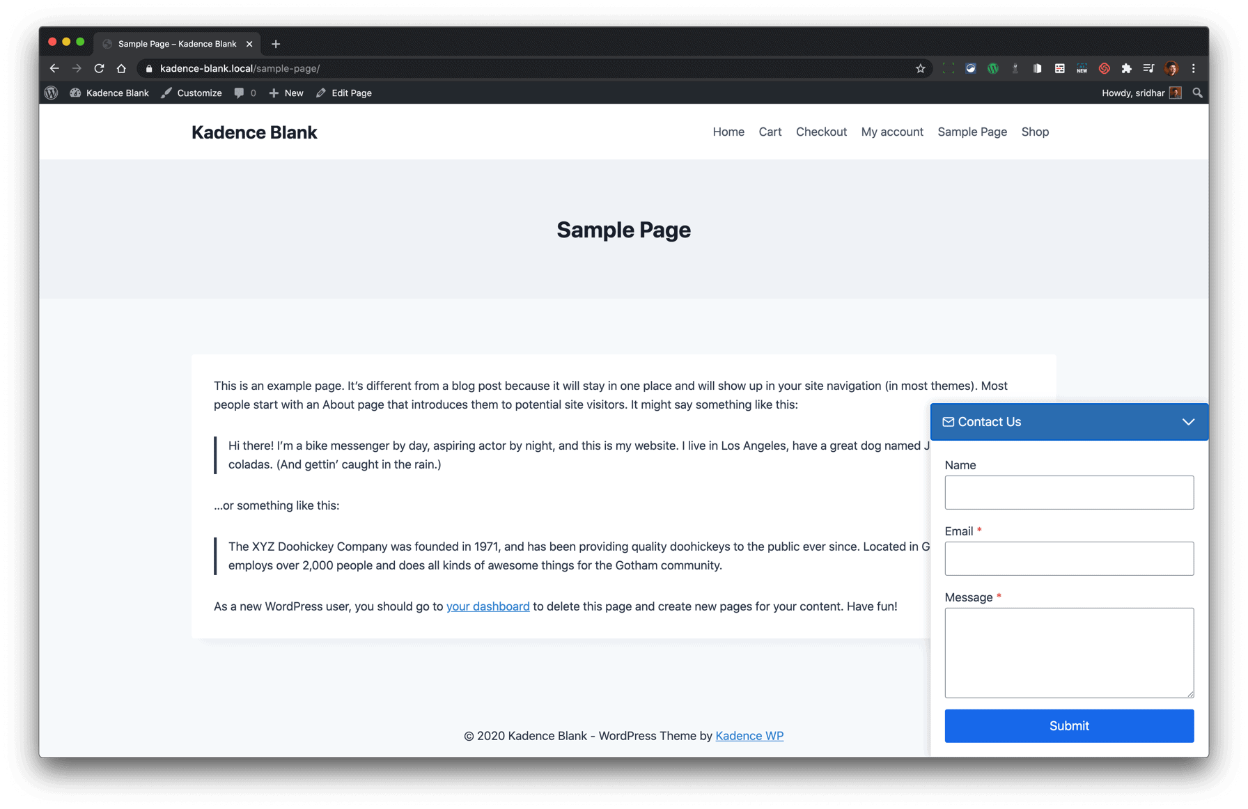
This article shows how we can use a Kadence fixed element to set up a panel positioned at the bottom right side of browser window which can be opened and closed. This can be used for adding contact forms, call to actions or other promotional info so users can easily access them.
Live example: The “Deals You Don’t Want to Miss” panel on this site.
After implementing the steps below you’ll have the following working:
Prerequisites
- Kadence theme
- Kadence Theme Pro
- Kadence Blocks
The basic idea is to place the actual content (contact form in this example) inside an Accordion block.
Step 1
Make sure Kadence, Kadence Pro and Kadence Blocks (free version will do) are installed and active.
Step 2
Enable Hooked Elements at Appearance > Kadence.
Step 3
Visit the blocks management page at yoursite.com/wp-admin/edit.php?post_type=wp_block and import this block.


Edit the block and configure it to your liking.
Step 4
Create a new hooked element at Appearance > Kadence > Elements.
Select FIXED Element Type.
Set a title of say, “Fixed Contact Form”.
Click in the content area and the big + near the top left.
Under Reusable tab, click Fixed Contact Form (or whatever is the name of the block, if you have renamed it).
Click Element Settings icon near the top right.
Placement: Fixed on Bottom
Display Settings Show On: Entire Site (or wherever you want to show this)
Optionally set Device Settings and Expires Settings as needed.
Step 5
By default, “Fixed on Bottom” fixed element will be centered at the bottom of the pages. Let’s move it to the right.
Also, we want to reverse the icons that appear in the closed and open states.
To take care of the above, in the Customizer’s Additional CSS section, add
/* Fixed element at bottom right */

.right-aligned .kt-row-column-wrap {
	margin-right: 0 !important;
}

.no-bottom-margin {
	margin-bottom: 0;
}

/* to prevent element from taking up height causing a gap at the bottom */
.kadence-pro-fixed-wrap {
	position: absolute;
}

/* closed state */
.kadence-pro-fixed-below .kt-accodion-icon-style-arrow .kt-blocks-accordion-header .kt-blocks-accordion-icon-trigger:before {
	-webkit-transform: rotate(-45deg);
	transform: rotate(-45deg);
}

.kadence-pro-fixed-below .kt-accodion-icon-style-arrow .kt-blocks-accordion-header .kt-blocks-accordion-icon-trigger:after {
	-webkit-transform: rotate(45deg);
	transform: rotate(45deg);
}

/* open state */

.kadence-pro-fixed-below .kt-accodion-icon-style-arrow .kt-blocks-accordion-header.kt-accordion-panel-active .kt-blocks-accordion-icon-trigger:before {
	-webkit-transform: rotate(45deg);
	transform: rotate(45deg);
}

.kadence-pro-fixed-below .kt-accodion-icon-style-arrow .kt-blocks-accordion-header.kt-accordion-panel-active .kt-blocks-accordion-icon-trigger:after {
	-webkit-transform: rotate(-45deg);
	transform: rotate(-45deg);
}
That’s it!


Amazing post, thanks!! I am loving Kadence theme more and more everyday!
That worked perfectly! How can I have this also popup when a button in my header is clicked?